
How Claude Built a Custom MailerLite Newsletter Header and Footer
And why your header and footer deserve more than the MailerLite drag-and-drop editor
If you've ever tried to make your MailerLite newsletter look truly on-brand, you'll know the drag-and-drop editor does a solid job for the main body of your email. For the content you change with every send, it makes complete sense - you don't want to be diving into code every time you write a newsletter.
But the header and footer? That's a different story. These are the elements that stay the same across every email you send. They're your brand's first and last impression. And this is exactly where MailerLite's built-in design tools hit their ceiling.
That's what I discovered when I was building a newsletter template for a client - a leadership consultancy with a visual identity rooted in deep navy, warm gold accents, and elegant serif typography. The kind of brand that needs its email communications to feel just as considered as its website.
The drag-and-drop editor couldn't deliver the level of refinement the header and footer needed. So I partnered with Claude to build custom HTML for those two bookend elements, while keeping the drag-and-drop editor for the newsletter content in between. The result was the best of both worlds: a polished, branded frame around every email, with the flexibility to create body content quickly each week without touching any code.
Why Custom MailerLite Headers Beat the Drag-and-Drop Editor
To be clear, I'm not suggesting you abandon MailerLite's visual editor entirely. For the body of your newsletter (the content that changes with every send) it's efficient and practical. But for the header and footer, the elements that define your brand across every single email, here's where it struggles:
Colour and typography control is surface-level. You can pick a background colour and change fonts, but you can't layer subtle opacity effects on gold accent lines, or create the kind of fine typographic hierarchy (letter-spacing, text-transform, specific font stacks) that makes a design feel crafted rather than templated.
Full-width backgrounds are tricky. Email design relies on a nesting technique where an outer table carries the background colour edge-to-edge, while an inner table constrains the content to a readable width (typically 600px). The drag-and-drop editor doesn't give you that level of structural control, which means background colours often stop at the content edge rather than bleeding to the full width of the email.
Navigation bars are limited. We wanted a desktop navigation bar with fine gold hairline dividers between the links, the kind of subtle detail that elevates a header from functional to elegant. MailerLite's nav blocks don't offer that level of customisation.
Social icons are generic. MailerLite provides standard social media icons, but if your brand uses a specific colour palette (in our case, a warm gold on a dark navy background), you need custom icons. We ended up creating bespoke gold outline icons at high resolution for crisp rendering.
Footer design is an afterthought. Most email platforms treat the footer as a legal necessity rather than a brand touchpoint. With custom HTML, we were able to create a footer that felt like a natural extension of the header with the same visual language, and same refined details.
How the Human-AI Partnership Actually Works
Here's what people often misunderstand about working with AI on technical projects like this: the AI doesn't make the creative decisions. I do. But when you give it good brand materials to work from, it can produce a surprisingly strong first attempt.
My role throughout this build was as the strategic director and quality controller. I curated which brand materials to share, made the initial brief about what the header should include and communicate, and then - crucially - evaluated every output. I'm the one who spotted what wasn't quite right: that gold tone was slightly off, those dividers were too heavy, this spacing didn't feel balanced. I directed each refinement based on my understanding of the client's brand and what would work in their audience's inbox.
Claude's role was as the technical implementer with strong brand comprehension. It analysed the brand materials I provided, understood the visual language, and generated a first draft that captured the right tone. Then, as I identified refinements, Claude translated those into code. When I said "the logo needs to be smaller," Claude adjusted the pixel dimensions. When I said "that gold isn't quite right," Claude modified the hex value. When I identified that the navigation was cramped on mobile, Claude wrote the media query to hide it.
This division of labour is exactly why the partnership works so well. I don't need to know how to write a CSS media query or structure nested tables in HTML email code. But I absolutely need to know whether the design feels on-brand, whether the hierarchy is working, whether the spacing creates the right impression. Those are human judgments that require brand understanding, aesthetic sensibility, and strategic thinking about how this header will land with the client's audience.
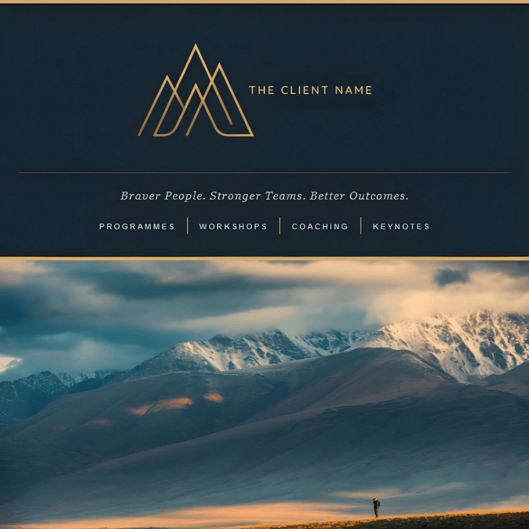
Custom HTML newsletter header designed with Claude AI, featuring a navy background, gold monogram logo, tagline, and desktop navigation bar.
The AI can't make those calls. But once I've made them, the AI can implement them faster and more accurately than I could hand-code them myself. And when you feed it comprehensive brand materials upfront, it can get you to that 80% mark on the first attempt, which means you're spending your time on refinement rather than starting from scratch.
Step-by-Step: Creating a MailerLite HTML Header with Claude
The beauty of this approach is that it's genuinely conversational, but I'm directing the conversation at every stage.
I started by sharing the brand context. I gave Claude the client's website, their brand lookbook, and their logo. I described what I wanted in the header: logo placement, tagline, navigation structure, visual tone.
Claude generated the HTML - and honestly, the first attempt was surprisingly good. Because Claude had familiarised itself with the brand materials, it pulled the right colours, understood the typography hierarchy, and captured the refined-but-not-corporate tone. It wasn't perfect, but it was a solid starting point that clearly demonstrated understanding of the brand.
I pasted it into MailerLite's HTML block, previewed it, and identified the refinements needed. The logo was too large. The nav dividers were too thick. The gold wasn't quite the right shade. These weren't wholesale redesigns - they were the kind of precise adjustments you make when something is 80% there and you're bringing it to 100%. Each of these was a creative judgment I made by looking at the preview and assessing whether it met the standard I was aiming for.
Claude implemented the changes. Each round of feedback took seconds to implement because Claude understood the context of what we were building, but I was the one deciding whether each iteration was an improvement.
The footer followed the same pattern. I directed the overall design - it should mirror the header, maintain visual consistency, include specific content elements - and then evaluated each iteration until it met my standards.
Key Lessons From the Build
The Two-Table Structure Is Everything
The single most important technical pattern in email HTML is the outer wrapper / inner content table structure. The outer table sits at 100% width and carries the background colour, so it bleeds to the edges of the email client. The inner table is constrained to a max-width of 600px and centred with align="center". Without this, your background colour stops at the content edge and you get ugly white strips down the sides.
Mobile Responsiveness Matters More Than You Think
Email clients on mobile devices render things differently, and a nav bar that looks elegant on desktop can become a cramped mess on a phone. We used a CSS media query (@media only screen and (max-width: 480px)) to hide the navigation links entirely on mobile, showing only the logo and tagline. This is a much better user experience than trying to squash four navigation links into a 320px-wide screen.
The key responsive techniques we used: max-width: 100% and height: auto on images so they scale down gracefully, percentage-based widths on the inner content table rather than fixed pixel widths, and hiding non-essential elements on smaller screens.
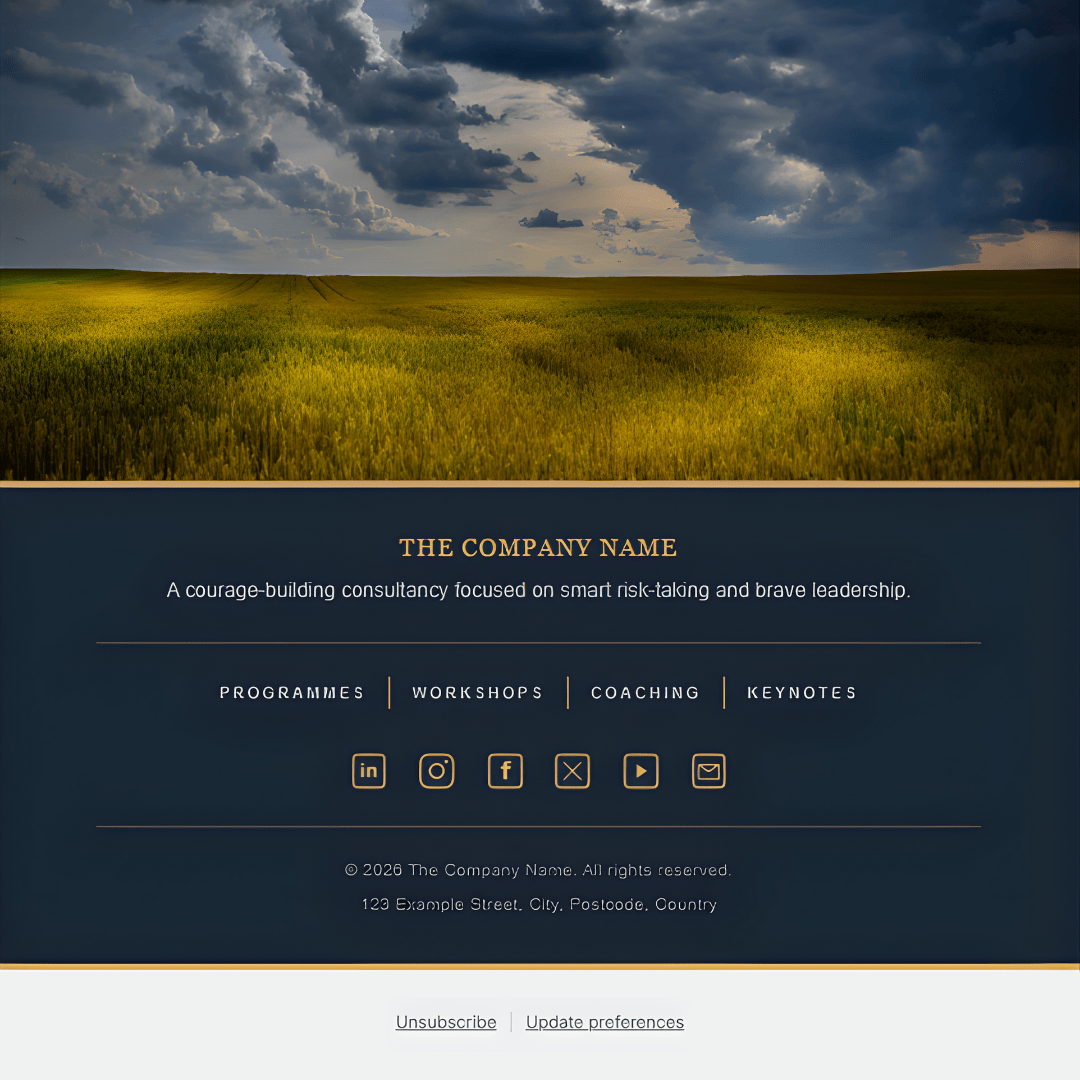
Custom HTML Mailerlite newsletter footer designed with Claude AI, including branded navigation and bespoke gold social icons.
Social Icons Need to Be Customised
If your brand uses specific colours, the standard social media icons that email platforms provide won't cut it. MailerLite offers a set of default social icons, but they come in fixed styles that may not complement a dark background or a specific brand palette.
This is where Claude surprised me. Rather than sourcing icons from a third-party library, I asked Claude to generate bespoke social media icons in the client's brand gold (#d6af70). Claude wrote a Python script using the Pillow imaging library and created a complete set (LinkedIn, Instagram, Facebook, X, YouTube, and an envelope for email) as transparent PNGs, right there in the conversation.
The first set came out at 48×48 pixels, which looked slightly pixelated when displayed at 24×24. So I asked for crisper versions, and Claude regenerated the entire set at 96×96 pixels for sharper rendering. The difference was immediately noticeable.
We also iterated on the design itself. The YouTube and envelope icons initially had different shaped frames to the others; a wide rectangle for YouTube, a landscape envelope shape, which made the row look inconsistent. I asked Claude to put them inside the same rounded square border as the LinkedIn and Instagram icons, and then to make the envelope slightly smaller within its box so it had more breathing room. Each of these refinements took seconds.
The icons were saved as transparent PNGs and uploaded to the client's Squarespace asset library for hosting. One thing we discovered: some hosting platforms can strip transparency from PNG files during upload. If your icons show up with a white background instead of being transparent, try uploading through the platform's file manager rather than the image uploader, or use .webp format instead.
The Unsubscribe Link Question
This one caught us out and is worth understanding properly. Email marketing platforms are legally required to include unsubscribe links in every campaign (CAN-SPAM compliance). MailerLite handles this automatically by appending its own footer.
We initially built custom-styled unsubscribe and update preferences links into our HTML footer using MailerLite's merge tags — {{UnsubscribeLink}} and {{UpdatePreferencesLink}}. These are dynamic placeholders that MailerLite replaces with subscriber-specific URLs when the email is sent. So they do actually work.
However, when we tried to save the newsletter, MailerLite's validation flagged that the unsubscribe link was missing. It scans for its own footer block specifically, not just the merge tag in custom HTML. The merge tags would have functioned correctly when sent, but MailerLite won't let you save without its own footer enabled.
The practical solution: remove the custom unsubscribe links from your HTML footer and let MailerLite's automatic footer handle the legal requirements. It won't be styled to match your brand, but it avoids duplication and keeps the validation happy. It's a small compromise for an otherwise fully custom design.
Gold Lines and Visual Consistency
One of the details that made the biggest difference was the use of gold accent lines throughout. We used two variations: a bold 4px line in the brand gold (#d6af70) at the very top and bottom of both the header and footer as full-bleed bookends, and a subtle 1px inset rule at 40% opacity as a delicate divider between content sections. This created a visual rhythm that carried through the entire email.
The nav link dividers in the header used a slightly different gold (#c4aa5f) sampled directly from the logo, with no opacity, creating a clean 1px border-left on each table cell. Small details, but they're the difference between something that looks templated and something that looks designed.
What You Need to Get Started
If you want to try this yourself, here's what to prepare before you start your conversation with Claude:
Your brand assets. Logo file (ideally PNG with transparent background), exact hex colour codes, font choices, and any brand guidelines you have. The more specific you are, the better you can evaluate whether the output matches your standards.
Your content plan. Think about what you want in the header (logo, tagline, navigation links?) and footer (about text, social links, contact details?). Have your social media profile URLs ready. These are strategic decisions you need to make upfront.
Hosted images. Any images in your email HTML need to be hosted somewhere with a public URL. Squarespace's asset library works well. The URL needs to point directly to the image file (ending in .png, .jpg, or .webp), not to a page containing the image.
Your MailerLite template. Open a new campaign or template in MailerLite and familiarise yourself with adding an HTML block. That's where your custom code will live, and you'll need to preview regularly to evaluate the results.
The Workflow in Practice
The actual process is straightforward, but notice how each stage requires your active direction:
You set the brief and provide brand materials. Open a conversation with Claude and share comprehensive brand context: your website URL, visual references, brand guidelines, logo files. The quality of what Claude produces is directly related to the quality of the brand materials you provide. Be specific about what you want the header to achieve and include.
Claude generates the code. If you've provided good brand materials, this first attempt should be surprisingly solid - capturing the right visual tone, colour palette, and hierarchy. You download or copy the HTML file.
You evaluate the result. Paste it into a MailerLite HTML block and preview it. This is where your judgment matters: does it meet your brief? Does it feel on-brand? What refinements would take it from good to excellent?
You direct the refinements. Feed back what needs adjusting - colours, sizing, spacing, content. These are often precise tweaks rather than wholesale changes: slightly smaller logo, thinner dividers, adjusted gold tone. Your role is quality control and brand expertise.
Claude implements your changes. You preview again and repeat until you're satisfied with every detail.
Then you do the same for the footer. Save it as a separate HTML block that sits at the bottom of your template.
The whole process for this client took several rounds of iteration, but we started from a strong foundation because the brand materials gave Claude enough context to understand what "refined, courageous, elegant but not corporate" actually looked like in practice.
Is It Worth the Effort?
For brands where visual consistency and professionalism matter, absolutely. And the beauty of this approach is that it's a one-time investment. You build the header and footer once, save them as HTML blocks in your MailerLite template, and they frame every newsletter you send from that point on. The weekly work of creating your actual newsletter content still happens in the drag-and-drop editor, exactly as before.
The difference between a MailerLite template with default header styling and one with custom HTML bookends is striking. It transforms the newsletter from something that looks like every other email in your inbox into something that feels unmistakably yours.
And because you're partnering with AI rather than hand-coding or outsourcing to a developer, you maintain complete creative control while delegating the technical implementation. You don't need to know HTML. You just need to know what you want, be able to evaluate whether the output meets your standards, and be willing to iterate.
The result was a newsletter that carries the client's brand identity from the moment it lands in someone's inbox: navy and gold, elegant typography, refined details. It looks like it was designed by a specialist email designer, because in the ways that matter, it was. I made every design decision. Claude just handled the code.
FAQs:
-
Yes. MailerLite's email editor includes an HTML block that you can drag into any template. You paste your custom code into this block and it renders alongside the standard drag-and-drop content. This is how the custom header and footer in this article were built - as HTML blocks sitting at the top and bottom of an otherwise standard MailerLite template.
-
No, you don't need to write code yourself. But you do need to know what you want and be able to evaluate whether the output meets your standards. The process is conversational: you describe your brand, specify what elements to include, and provide reference materials. Claude generates the HTML based on your direction. Then you preview the result in MailerLite and make the creative judgments: is that gold tone right? Is the logo too large? Does the spacing feel balanced?
Your role is as the creative director and quality controller. You're making every strategic and aesthetic decision. Claude's role is as the technical implementer, translating your decisions into code. When you say "the navigation dividers are too thick," Claude adjusts the pixel width. When you spot that the gold isn't quite matching your brand palette, Claude modifies the hex value. You never need to read or edit the code yourself, but you absolutely need to bring design judgment and brand expertise to the process.
-
It can, but it needs to be built with mobile responsiveness in mind. Standard HTML tables don't automatically adapt to smaller screens. In our build, we used media queries to hide the navigation bar on mobile (where it would be too cramped) and ensured images scale down with percentage-based widths. If you ask Claude to make the header mobile-responsive, it will build these techniques in from the start.
-
MailerLite requires an unsubscribe link in every campaign and will append its own footer automatically if you don't include one. You can add styled unsubscribe links to your custom footer using MailerLite's merge tags, but be aware that MailerLite's save validation looks for its own footer block - so you may still need to keep the default footer enabled. In practice, it's simplest to let MailerLite handle the unsubscribe link and keep your custom footer focused on branding.
-
Yes. The CAN-SPAM Act requires every commercial email to include a valid physical postal address. This can be a street address, a PO box, or a registered private mailbox. If MailerLite's automatic footer already includes your address, you may not need to duplicate it in your custom HTML - but check what MailerLite is appending to make sure it's covered.
-
Yes, but this requires your direction and refinement. When I needed bespoke social media icons in a specific brand gold for a client's dark navy footer, I asked Claude to generate them. Claude created the initial set as 48×48 pixel transparent PNGs using a Python imaging library.
Then I evaluated the output. When I previewed them at their display size, I spotted they looked slightly pixelated, so I directed Claude to regenerate them at 96×96 for crisper rendering. Then I noticed the YouTube and envelope icons had different shaped frames than the LinkedIn and Instagram icons, which made the row look inconsistent. I asked Claude to standardize the frames. Another iteration: the envelope looked cramped, so I specified it should be smaller within its box for more breathing room.
Each of these refinements came from my visual assessment and brand expertise. Claude executed each adjustment instantly, but I was the one spotting what needed to change and why. The icons ended up looking professionally designed because they went through multiple rounds of quality control. Without that human direction, they'd have been functional but not refined.
-
I used Claude Pro for this project, which gives access to Anthropic's most advanced model. However, the free version of Claude is perfectly capable of generating email-compatible HTML - this isn't a task that requires the most powerful model. Where the Pro plan really shines is in longer, iterative sessions - the kind where you're going back and forth refining details over multiple rounds. The free plan has stricter usage limits, so you might find yourself running out of messages mid-session. If you're planning a one-off build with several rounds of tweaks, Pro is worth it for the uninterrupted workflow.
Your business has a voice. Your newsletter should too. Sophie's Bureau brings calm, coherent digital operations to consultants and purpose-led businesses - including email designs, Squarespace websites, and AI workflows that hold together beautifully.